


Name: Norman Kuring
Formal Job Classification: Oceanographer
Organization: Code 610.2 (Mail Code 616.2), Sciences and Exploration Directorate
What do you do and what is most interesting about your role here at Goddard? How do you help support Goddard’s mission?
I’m an oceanographer. Our group does oceanography connected to the color of the ocean, which we measure using instruments on satellites operated by NASA and other international partners. We use those data to look at the ocean to see how the ocean reflects sunlight in different wavelengths. This helps us locate phytoplankton and determine their concentrations. Phytoplankton are the basis of most of the food webs in the oceans. They are also very important in removing carbon dioxide from the atmosphere and providing roughly half of the oxygen we have to breathe.
How did curiosity lead you to become an oceanographer at Goddard?
Growing up, I watched Jacques Cousteau and Marlin Perkins on television exploring the natural world. I was fascinated by a world that I had not been aware of and one that I had never visited, particularly the underwater world. Through my high school years, I spent significant amounts of time exploring the woods around my house near the Smoky Mountains. I loved the biology of the natural world. I was so taken with the oceans that I decided to try out oceanography.
I got an undergraduate degree in biological oceanography from the Florida Institute of Technology in Melbourne. I got a master’s in biological oceanography at Dalhousie University in Halifax, Nova Scotia, Canada.
While at Dalhousie, I did a summer internship at Goddard in 1986 with the progenitors of the ocean color group that I’m with today. We’re a unique group with interesting backgrounds. We socialize with each other after work sometimes and at occasional lunchtime BBQs. I haven’t quite figured out why our group works as well as it does, we just all like and respect each other. We also have interesting lives outside of work.
Who uses the data?
I write programs that allow the wider oceanographic science community to locate scenes of particular interest to their research. Tremendous amounts of data without any hint of what they represent are not very useful. The ability to browse imagery customized to show certain features in the water and whether or not the water is obstructed by clouds goes a long way towards finding data useful to a specific research area.

Fisheries scientists, climate scientists, water quality managers and atmospheric scientists all use our data to improve humanity’s understanding of how the Earth works. Ocean-going researchers often use our data to help plan their cruises. They, in turn, send us data that they collect at sea that we can use to improve our satellite data products. Fishermen also use our data to help make their fishing operations more efficient.
What do you look for in the data?
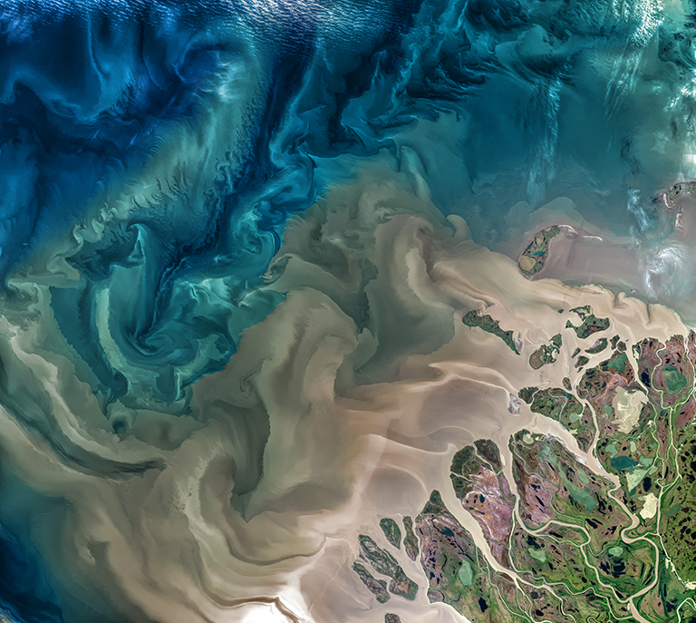
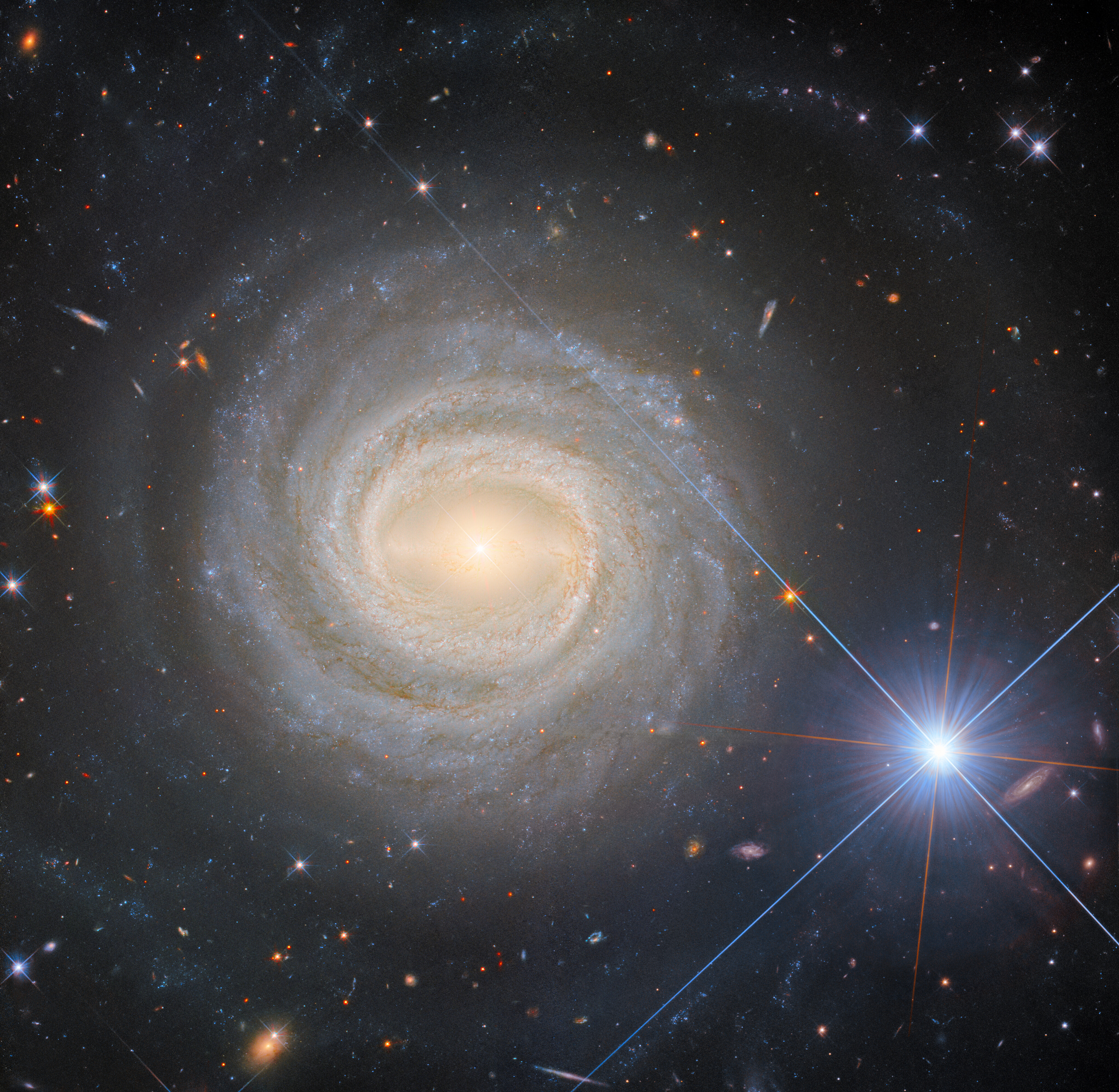
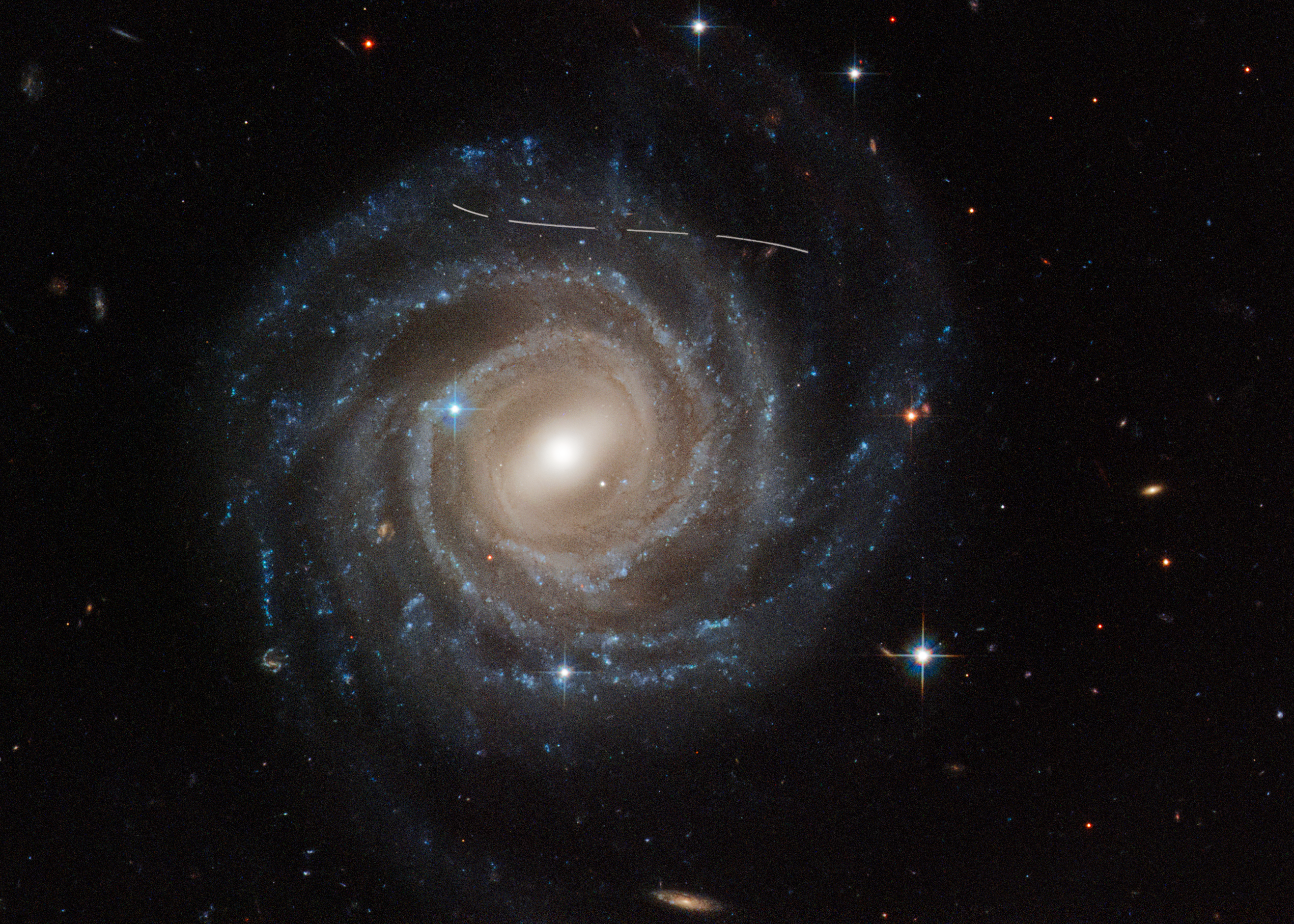
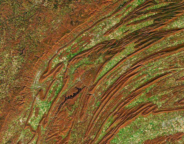
One of the first things I do in the morning when I come in to work is bring up the most recent day’s browse scenes (small images with low resolution) scroll through them, and see if any features in the ocean jump out at me. They could be eddies, sudden changes in chlorophyll concentrations, big sediment plumes from rivers, anything that looks out of the ordinary or that is a particularly cloud-free, clear representation of the ocean.
I look for whatever I personally find interesting in the ocean color data. When I’m looking for an image, I rarely find the perfect candidate. It is usually more along the lines of this is OK, this one might be a little better. It is just the degrees of what I consider suitable for what I’m trying to illustrate. If I looked at it again two months later, I might pick a different set of data. There is always a cloud, some sun glint or a scene edge just in the wrong place.
When I find something that catches my eye that I hope will catch the public’s imagination or illustrate some ongoing event such as a harmful algal bloom, a flooding event or a known phytoplankton bloom in some part of the world, I pull up the image to its full resolution. I then process the data to remove certain atmospheric effects and to enhance the color and contrast. I try to project the data in the most interesting way. I sometimes do a perspective view showing the curve of the Earth. I also try to use some artistic composition techniques to make the image attractive, but I don’t consider myself an artist.
I don’t think of myself as a perfectionist, but I want to find the best possible image I can. I’m not necessarily looking for something specific. I just try to recognize the unexpected.
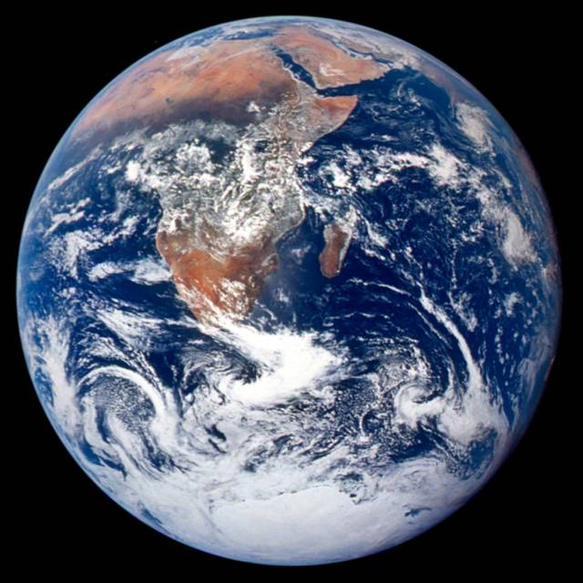
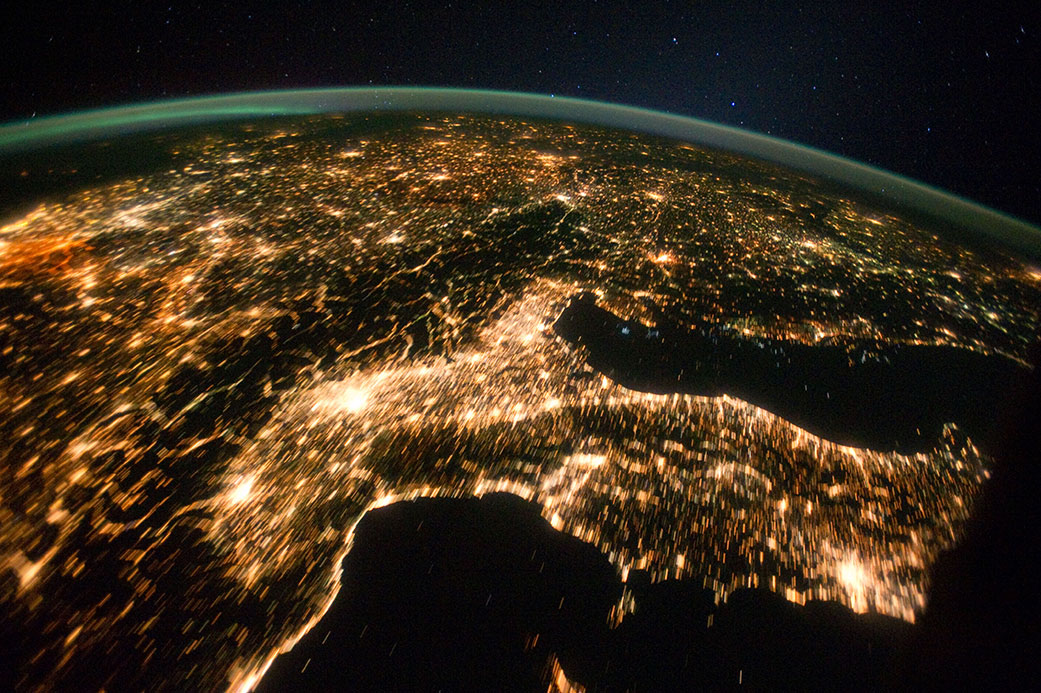
How did the Blue Marble 2012 come about?
Jim Gleason, a project scientist for the Visible Infrared Imaging Radiometer (VIIRS) on the Suomi NPP satellite, asked me for an image of VIIRS ocean color to take to an American Meteorological Society Meeting in New Orleans. I looked for a day that was relatively cloud free and showed interesting features on land and on the water. For this image, I stitched together images from four satellite orbits which works out to about six hours’ worth of data.
The Blue Marble 2012 shows North America and part of South America, only about an eighth of the globe. Since the meeting was in New Orleans, I wanted to include New Orleans. I also wanted the water at least around the coast to show some ocean color phytoplankton (green) and sediment (brown). The VIIRS instrument had been operating for less than two months, so I had a relatively small number of days to choose from. I browsed through the data and made my subjective choice of Jan. 4, 2012 as the best day for my composite. In January, sun glint is a problem in the Southern Hemisphere and darkness is a problem in the Arctic, so I chose to place the viewer close enough to the Earth that those two regions would be hidden beyond the horizon. Basically, I wanted a clean color distribution that was relatively cloud free, with good features in the water, minimal sun glint and minimal darkness.
I spent a few days, less than a week, searching and assembling.
The original Blue Marble was the Apollo image. When I made this image, I was not thinking of that Blue Marble. Someone else named it.
Why does this image only show about one eighth of the globe?
Because I chose to place the viewer so close to the Earth (one third of an Earth radius above the surface), the portion of Earth’s surface that is visible is one eighth of the total. That’s just how the geometry works out.
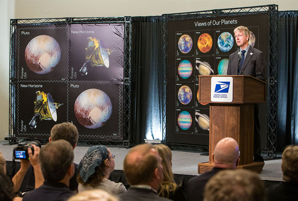
Did you ever think that your image would become a postage stamp?
I didn’t realize that my image was even being considered for a stamp until it was already decided. On Dec. 29th, 2015, I was told that this image would become a stamp. This image is one of eight on a sheet including Mercury, Venus, Earth, Mars, Jupiter, Saturn, Uranus and Neptune. Pluto has its own stamp with the New Horizons spacecraft. All the images come from NASA satellites.
How did you feel attending the first day stamp release ceremony of your image?
I was pleased and surprised by the crowd’s interest, but I was also very nervous about my speaking role. My wife was beyond the moon excited. I’m a very low-key kind of person, but I still find the attention flattering though most unexpected.
On May 31, 2016, I was in Manhattan at the first day release ceremony at the World Stamp Show, which is only held every 10 years. I was one of the speakers. I talked about how fascinating it is that we can collect data from different planets, that we’re a curious species and want to know more about the universe. But there is only one planet that we know of that will support human life and that is Earth. Then I showed the stamp.
Dave Williams, the chief operating officer of the Post Office was there. Ellen Stofan, NASA chief scientist; Jim Green, NASA director of planetary science; and Alan Stern, New Horizons principal investigator, Southwest Research Institute, were also speakers.
Why do you think the Blue Marble 2012 image is so popular?
I didn’t have the first clue that this image would become so popular. I get requests for images of different parts of the world all the time, but those images don’t take off like this one did. I don’t know why.
On NASA’s Flickr site, the image has more than six million views.
It is very difficult to predict what will capture the public’s interest. I do not think that I could make another image as popular. While I’m not in the business of making viral imagery, I do try to make imagery that is appealing. It is neat and I’m glad that it is so popular, but I am puzzled as to what makes this image more special than some of the others. I’m still flabbergasted.
I think perhaps that this image, and others like it, are popular because we see our home. The blues, whites, greens and browns that you see are the air, water, soil and plants that we depend on for life.
What is next for you?
I’m the kind of guy who, left to my own devices, always comes back late from a hike. That inexorable tractor beam of curiosity keeps pulling me around the next bend, or block, then over the next ridge, or bridge, toward whatever might lie beyond.
The wider, unexplored universe pulls on me the same way. The space programs of the United States and other countries fuel my curiosity by gathering imagery like that used for the Blue Marble 2012.
As I talked about in my stamp-show speech, during the industrial revolution, humans got “out of tune” with Mother Earth. Today, the mountains of Earth data tell us that we are even more “out of tune” than ever with Mother Earth as greenhouse gases fill our skies, plastics fill our oceans and species go extinct at an alarming rate.
I am very concerned, but also curious, about what is around the next bend in Earth’s future. I look through satellite data like these every day at work in hopes of catching a glimpse.
We humans are, for better and for worse, a very clever species. I believe we can reverse the damage we are going to the Earth if we put our minds to it.
We live on a remarkably beautiful planet. We need to take care of her. Appreciate nature, go outside and explore.
By Elizabeth M. Jarrell
NASA’s Goddard Space Flight Center, Greenbelt, Md.

Conversations With Goddard is a collection of Q&A profiles highlighting the breadth and depth of NASA’s Goddard Space Flight Center’s talented and diverse workforce. The Conversations have been published twice a month on average since May 2011. Read past editions on Goddard’s “Our People” webpage.